Brand
Mission
To transform online the entertainment industry through tech innovations.
Key Elements of Brand Identity
The correct spelling of the brand and company name is to use all caps – SOFTSWISS. This spelling came into effect in 2022 after the re-branding.
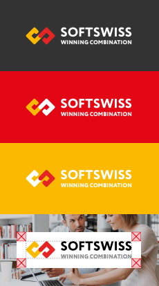
The key visual identity element of the brand is its logo. It represents a unique lettering and graphic element blended into a single composition.
The infinity symbol that refers to the capital letter of the logo stands for reliability, development, and flexibility – an infinite pursuit of success, as well as the inexhaustible potential of the SOFTSWISS team.
In some instances, the graphic element can be used separately from the lettering, for example in an avatar used on social media.


The colour palette captures the company’s friendly, dynamic image.
The corporate colour palette consists of four colours – red, yellow, black and grey.
The corporate colours are presented in various colour systems for the most accurate reproduction with the use of various technologies and on various carriers — from signboards to advertising materials.
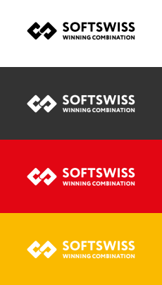
Whenever the logo is placed on the background of the corporate colour, the logo reversal option is used.
The logo is used on a white protection solid base with its dimensions equal to the size of the logo with the protection area on backgrounds that do not belong to the brand colours, as well as on complex backgrounds.

Single-colour logo versions are used whenever multicolour printing is unfeasible.

